The Freelancer's Brand Kit: Logo, Favicon, and Looking Pro on Every Invoice (2026 Guide)
🎯 Quick Answer
You can build a complete freelance brand kit (logo, favicon, color palette, fonts, invoice template) for $0 using Canva, Coolors, Google Fonts, and our own free favicon generator at FreeImageTools.org. Spend 2 hours once, then keep everything consistent across your invoices, website, social profiles, and email signature. Studies show consistent branding can lift revenue by around 23 percent, mostly because clients remember you and trust shows up faster.
And yes, the favicon matters more than you think.
So you're a freelancer. You have skills. You have clients. You have an invoice that says "Invoice 1" in Times New Roman with no logo, sent from a Gmail address that includes the word "lol" in it.
Look, I get it. Branding feels like the thing you'll figure out later, after the "real" work is done. But here's the awkward truth. Your brand isn't sitting in a Figma file waiting to be born. Your brand is whatever clients already think when they see your name. The question is just whether you're shaping that opinion on purpose, or letting it form by accident.
Good news: looking professional in 2026 is basically free. You don't need a designer. You don't need a $5,000 brand book. You need a logo, a favicon, two colors, two fonts, and the discipline to use them everywhere. That's it. This guide walks you through all of it, with specific tools, real numbers, and zero fluff.
Why Freelancers Underestimate Branding (And Why It Matters)
Most freelancers treat branding like flossing. We know we should, we feel slightly guilty about it, and then we don't.
The usual excuses sound something like this. "I'm not a designer." "Clients hire me for my work, not my logo." "I'll get a real brand once I'm bigger." Fair points, all of them. But also wrong, in ways that quietly cost you money every month.
Here's what actually happens when your brand looks like an afterthought. A potential client lands on your website, sees no favicon in the browser tab (just that sad gray globe), and clocks you as "small operation, probably new." They open your invoice, see a generic Word doc with mismatched fonts, and feel zero urgency to pay it. They forward your email to a colleague, who sees an email signature that's literally just your name in Calibri, and decides not to refer you to that big project they were thinking about.
None of these moments feels like a "branding problem." Each one feels like, well, nothing. That's the trap. Bad branding doesn't trigger alarms, it just costs you opportunities you never knew existed.
The flip side is also real. Lucidpress (now Marq) ran a study showing consistent brand presentation can increase revenue by an average of 23 percent. Other research from Forbes pegs it closer to 20 percent. The exact stat doesn't matter much. What matters is that clients judge competence partly by appearance, and appearance is mostly free to fix.
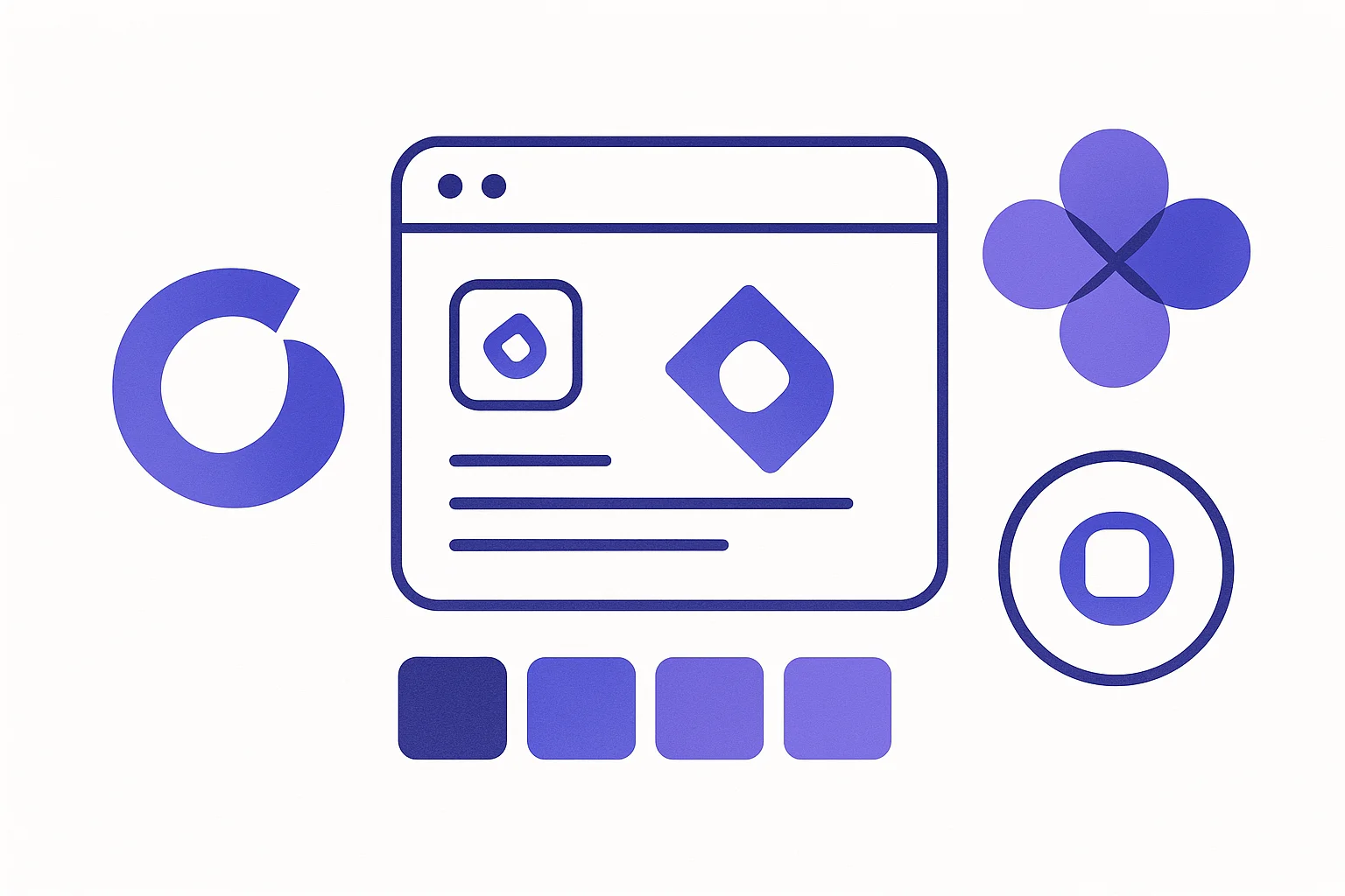
The 5 Pieces of a Minimum Freelance Brand Kit
Forget brand bibles and 80 page style guides. You need five things, and you can store them all in a single Google Doc or a free Notion page.
- A logo. Doesn't have to be fancy. A clean wordmark in a nice font counts. Add a tiny icon if you want.
- A favicon. The little icon in browser tabs. Generated from your logo in under 5 minutes.
- 2 to 3 brand colors. One primary, one accent, optionally one neutral. That's plenty.
- 2 fonts. One for headings, one for body text. Both free from Google Fonts.
- An invoice template. One you reuse forever, with your logo at the top.
That's the whole kit. Five things. If you've already got these and they're consistent, you're ahead of probably 70 percent of freelancers. If not, the next sections fix that, piece by piece.
Logo Design on a Budget (Canva, Looka, Hatchful, Adobe Express)
Let's get the big one out of the way. You don't need to pay $500 for a logo. You probably don't need to pay anything. The free tools have gotten weirdly good in 2026, and most freelance logos are simple wordmarks anyway, which AI tools handle just fine.
Here's how the major free options stack up.
| Tool | Best For | Free Tier | Catch |
|---|---|---|---|
| Canva | DIY wordmark logos with full editing control | Yes, plus 50 AI generations a month | Some elements are Pro only |
| Looka | AI logo from a few prompts, polished output | Free preview, $20 to download HD files | You'll likely pay to get usable files |
| Hatchful by Shopify | Quick logo packs in 5 minutes | Completely free, including downloads | Less customization, recognizable templates |
| Adobe Express | Clean logos with Adobe Fonts access | Free tier covers most needs | Bigger learning curve than Canva |
| Figma | If you want full control and like design | Free for solo work | You actually have to design it yourself |
My honest recommendation? Start with Canva or Hatchful. Make a wordmark version of your name in a strong font (Space Grotesk, Poppins, Inter, or Plus Jakarta Sans all look great), pick a color, and call it done. You can always upgrade later. Many successful freelancers I know used the same "made it in Canva" logo for years before redesigning.
If you want a tiny icon next to your name, search Canva or The Noun Project for a simple shape that vaguely relates to your work. A pen for writers. A camera shutter for photographers. A bracket for developers. Don't overthink the symbolism. Nobody is decoding your logo.
What to export. Always grab three versions of your logo: a PNG with a transparent background, an SVG (if your tool offers it), and a square version for social profile pictures. The square one is the bones of your favicon, which we'll get to next.
💡 Pro Tip: Make a "logo on dark" and a "logo on light" version. Sometimes you'll need white text, sometimes dark. Saves you from awkward "my logo disappeared on this background" moments later.
The Favicon Nobody Talks About (Sizes, Formats, Why It Matters for Trust)
Quick test. Open three tabs of freelancer websites right now. How many have a real favicon? How many have that generic gray globe icon that basically screams "I forgot one"?
The favicon is the smallest, dumbest, most overlooked piece of branding. And it's also one of the highest leverage things you can fix in an afternoon. It shows up in browser tabs (where attention happens), in bookmarks (where future memory happens), in browser history (where re-finding happens), and on Google mobile search results next to your link (where click-through happens). That's a lot of impressions for one tiny PNG.
Google rolled out favicon display in mobile search results back in 2020, and it's stuck around. A site with a custom favicon next to its title tag on mobile feels established. A site with no favicon feels half built. Same content, different vibe.
Favicon Sizes You Actually Need in 2026
Here's the reality. The "standard" favicon used to be one 16x16 ICO file. Then Apple added touch icons. Then Android added home screen icons. Then PWAs happened. Now there's a small zoo of sizes, and you should generate them all because the file weight is basically nothing.
| Size | Format | Where It Shows |
|---|---|---|
| 16x16 | ICO or PNG | Browser tab on standard displays |
| 32x32 | ICO or PNG | Browser tab on Retina displays, taskbar |
| 48x48 | ICO or PNG | Windows site icons |
| 180x180 | PNG | iOS home screen (apple-touch-icon) |
| 192x192 | PNG | Android home screen, PWA |
| 512x512 | PNG | PWA splash screens, app stores |
| SVG | SVG | Modern browsers, infinite scaling |
ICO vs PNG vs SVG, what's the deal? ICO is the old timer format that supports multiple sizes inside one file. Great for legacy browser support. PNG is the universal modern choice, used for everything from 32x32 tabs to 512x512 PWA icons. SVG is the future-proof option that scales perfectly at any size, though older browsers ignore it.
The good news: you don't have to pick. Generate all of them at once, drop them in your site root, and add a few link tags to your HTML head. Done forever.
Free Favicon Generators and How to Make One in 5 Minutes
If you spend more than 10 minutes on this, you're doing it wrong. The workflow is genuinely this short.
- Take your logo's square version (the icon part, not the wordmark). Make sure it reads at tiny sizes. If your logo is detailed, simplify it for the favicon. The browser tab is 16 pixels. Nobody can see your fancy gradient there.
- Upload that square PNG to our own free favicon generator at FreeImageTools.org. It is genuinely free, no signup, and it spits out every size you need plus the HTML snippet to paste in your site head.
- Unzip, upload the files to your website's root folder, paste the snippet into the head of every page.
- Hard refresh in an incognito window to confirm the new favicon shows up. Browsers cache favicons aggressively, so don't panic if you see the old one for a minute.
Total time: about 4 minutes if your logo is ready. The tools handle the resizing, the format conversion, the manifest.json file for PWAs, the whole thing. You just upload and download.
Quick tip on the source image. Start with a 512x512 or 1024x1024 PNG with a transparent background. Don't start with 32x32 and let the tool upscale, you'll get blurry icons. Bigger source, cleaner downscale.
Color Palette: Picking 2 to 3 Colors That Work Everywhere
Here's where freelancers go off the rails. They pick six colors. They want one for headings, one for body, one for CTAs, one for backgrounds, one for "fun," and one because they like teal. Six colors means you have to make a decision every time you design anything, which means you'll be inconsistent.
Pick three colors. Maximum.
- Primary brand color. The one you'd use for buttons, links, and brand highlights. Make it confident. Indigo, deep blue, emerald, dark purple, warm orange, all work great.
- Accent / secondary. Used sparingly for variety. Often a complementary or analogous color. Optional but nice.
- Neutral. A near black for body text and a near white for backgrounds. Don't use pure black, it's harsh. Try #0a0a0a or #18181b instead.
Free tools that make this easy:
- Coolors.co. Hit the spacebar to cycle through palettes until one feels right. Lock in the colors you like, generate variations.
- Canva Color Palette Generator. Upload an image you like, get a palette pulled from it.
- Adobe Color. Color wheel based, good for understanding why some colors look right together.
- Realtime Colors (realtimecolors.com). Tries your palette on a fake landing page so you see how it actually looks.
Once you have your three hex codes (something like #6366f1, #8b5cf6, #0a0a0a), write them down. Save them in your password manager, your phone notes, your Notion page, somewhere you'll find again. Use those exact codes everywhere. Same indigo on your invoice. Same indigo on your website. Same indigo on your LinkedIn banner. That's the whole game.
Typography: Free Fonts That Look Expensive
Picking fonts feels intimidating until you realize the answer is almost always "two fonts, one for headings and one for body, both from Google Fonts." Done.
Here are pairings that look like you paid a designer, but didn't.
| Heading Font | Body Font | Vibe |
|---|---|---|
| Space Grotesk | Inter | Modern SaaS, tech freelancer |
| Plus Jakarta Sans | Inter | Friendly, approachable |
| Playfair Display | Lora | Editorial, writers and consultants |
| Poppins | Open Sans | Clean, all-purpose |
| DM Serif Display | DM Sans | Premium, polished |
| Montserrat | Lora | Strong contrast, photography |
Pick one row. Stop second-guessing. Use those two fonts on your website, your invoice, your social graphics, your slide decks, everywhere. Consistency beats perfection by a mile.
If you want to see pairings before committing, Fontjoy.com generates pairings using ML, and Google Fonts itself shows recommended pairings on each font's page. Both are free.
One small but important note. Don't use 4 weights of one font. Use 2. Maybe 3. A regular, a bold, optionally a medium. That's enough hierarchy. Designers with too many weights look like they're trying too hard.
Brand Consistency: From Invoices to Websites to Email Signatures
This is where the magic actually happens. Anyone can pick colors. Few people apply them everywhere, every time. Here's the master checklist of touchpoints to update once and forget.
| Touchpoint | What to Brand | Free Tool |
|---|---|---|
| Invoice | Logo at top, brand color for accents, branded font in headers | FreeInvoicePDF.org (logo upload built in) |
| Website / portfolio | Favicon, fonts, colors, logo in header | Carrd, Notion sites, GitHub Pages, Webflow free tier |
| Email signature | Logo (small, hosted), name in brand font, color accent | WiseStamp free, MySignature, Canva |
| LinkedIn banner | Brand colors, your tagline in heading font | Canva (free template, 1584x396) |
| Social profile pictures | Square logo or branded headshot | Canva, remove.bg for clean cutouts |
| Proposals / contracts | Branded cover, headers, footer | Better Proposals free trial, Google Docs |
| Business cards | Logo, colors, fonts (digital or print) | Canva, Moo for actual printing |
| Slack / client portal avatars | Same square logo as social | Just upload the same file you used elsewhere |
The trick isn't doing it once. It's doing it once and then never deviating. When a client signs your proposal, hits your website (favicon!), gets your invoice, sees your email signature, and clicks your LinkedIn, they should feel like they're inside the same brand the whole time. That feeling builds trust faster than any "About Me" page ever could.
Putting Your Logo on Invoices (And Why It Matters Way More Than You Think)
Of all the places your brand shows up, the invoice is the one that affects your bank account most directly. A branded invoice gets paid faster. Why? Because it looks legit, it's easy for accounting departments to file, and it doesn't get lost in the "is this even real?" mental folder.
If your current invoice is a Word doc with no logo, you're leaving money on the table. Every. Single. Time.
The fix takes about 90 seconds. Head over to FreeInvoicePDF.org, click create a new invoice, and use the logo upload feature to add your PNG. Pick your brand color in the template options. Save the template. From now on, every invoice you generate has your logo at the top, automatically. You can read more about writing a professional invoice if you want the full breakdown of what goes on each line.
Want to see what a polished branded invoice actually looks like? Check out our invoice example gallery. The before-and-after is striking. Same numbers, totally different perception. Then grab one of our free invoice templates as a starting point.
For a deeper look at why a clean PDF beats every other invoice format, our PDF invoice guide covers it. And if you specifically freelance, our piece on how to invoice as a freelancer walks through the rates, terms, and follow-ups that get you paid.
Upload Your Logo. Get Paid Faster.
Branded invoices look more legitimate, get paid faster, and take 60 seconds to create. Drop your logo in, pick your color, and ship a pro-looking PDF every time.
Create Branded Invoice →Brand Kit on $0, $50, and $200 Budgets
Real talk. You can do all of this for nothing, but I'll lay out three tiers depending on how much you want to invest. Spoiler: most freelancers should stop at the $50 tier and put the rest of the money into client acquisition.
The $0 Brand Kit
- Logo: Canva free or Hatchful. Wordmark in a nice font, maybe a simple icon.
- Favicon: Generated from your logo's square version using FreeImageTools.org/favicon-generator.
- Colors: Coolors.co, pick 3 hex codes, write them down.
- Fonts: Google Fonts, one heading font and one body font.
- Invoice: FreeInvoicePDF.org with your logo uploaded.
- Email signature: WiseStamp free tier or hand-coded HTML.
- Total cost: $0. Total time: about 2 to 3 hours.
This is the right tier for 80 percent of freelancers. Honestly. Don't spend money on branding until you're booking work consistently.
The $50 Brand Kit
- Everything in the $0 tier.
- Canva Pro for one month ($15) to get premium templates, stock photos, and the brand kit feature for storing your assets in one place.
- Looka standard package ($20) if you want a polished AI logo with all the file formats included.
- A premium font from a foundry like Pangram Pangram (some are free, others $15 to $30) if you want something Google Fonts can't give you.
This tier makes sense if you've been freelancing for 6 months or more and want a small upgrade.
The $200 Brand Kit
- Everything above.
- A custom logo from a Fiverr designer ($50 to $150). Look for designers with strong portfolios and avoid the cheapest options, the quality drops fast below $40.
- A simple website using a paid Carrd plan ($19/year) or a low-cost Webflow / Framer template ($30 to $80).
- Printed business cards from Moo (around $25 for 50 cards, premium feel).
Honestly, this tier is overkill until you're at $50K+ in annual freelance revenue. Save the cash. Reinvest in client outreach instead. If you want more on that, our getting paid faster guide and our roundup of best free invoice generators are both worth a read.
Common Mistakes That Make You Look Less Pro
A few things I see freelancers do that quietly hurt them.
- Using 5 different fonts. One on your website, another on your invoice, a third in your email signature. Nobody notices consciously, but it feels chaotic. Stick to two.
- Logo file that's stretched. If your PNG is 200x80 and you stretch it to 400x80, it looks bad. Always upload the original aspect ratio.
- Using your logo as a tiny watermark. If a client can't see your logo at a glance, it's not doing its job. Make it readable.
- Missing favicon. Already covered, but worth repeating. The gray globe is a tell.
- Different color values across tools. "Indigo" in Canva is not the same as "indigo" in Word. Use exact hex codes.
- Hot pink and lime green together. If you're not sure, your colors might be wrong. Run them by a friend who has good taste. Or use Realtime Colors to sanity check.
The 2 Hour Brand Kit Sprint
Want to actually do this? Block off 2 hours this weekend. Here's the playbook.
- 0:00 to 0:20. Open Canva or Hatchful. Make a wordmark logo. Pick a font you like. Set it in your primary color. Export PNG (transparent), SVG, and a 1024x1024 square version.
- 0:20 to 0:35. Open Coolors.co. Hit spacebar until you find a 3 color palette you like. Write down the hex codes.
- 0:35 to 0:45. Pick your two Google Fonts using one of the pairings from the table above. Bookmark their pages.
- 0:45 to 0:55. Upload your square logo to FreeImageTools.org/favicon-generator. Download the zip. Upload to your site root, paste the HTML snippet into your head.
- 0:55 to 1:15. Update your email signature with logo, fonts, brand color. Use WiseStamp or a free generator.
- 1:15 to 1:30. Update your LinkedIn banner using a Canva 1584x396 template with your colors and tagline.
- 1:30 to 1:50. Head to FreeInvoicePDF.org, upload your logo, build a default invoice template with your brand color, save it. From now on, every invoice is on-brand by default.
- 1:50 to 2:00. Create a Notion page or Google Doc called "Brand Kit." Paste your hex codes, font names, and links to your logo files. Future you will thank present you.
Two hours. Done. You now have a brand kit that 90 percent of freelancers don't bother building. Your invoices look professional. Your favicon is doing its small but important job. Your colors are consistent across every touchpoint. And you spent zero dollars.
Frequently Asked Questions
Do freelancers really need a logo?
Not strictly. You can run a successful freelance business with just a clean wordmark in a nice font. But a simple logo helps clients remember you, makes your invoices feel legit, and takes about 20 minutes to create with free tools like Canva or Looka. Skip the logo if you're testing whether freelancing is for you. Make one once you've booked your second or third client.
What favicon sizes do I actually need in 2026?
At minimum, generate 16x16 and 32x32 for browser tabs, 180x180 for the apple-touch-icon, and 192x192 plus 512x512 for Progressive Web App support. Our own free favicon generator at FreeImageTools.org/favicon-generator produces all of these from one square image in about 30 seconds. There's no reason to skip any size, the file weight is tiny.
ICO, PNG, or SVG for favicons?
Use a multi-size ICO file for legacy browser compatibility, PNG for modern browsers and the apple-touch-icon, and SVG if you want crisp scaling on high-DPI screens. A favicon generator gives you all formats at once, so you don't have to pick just one. Just upload everything and let the browser pick what it wants.
How much should a freelancer spend on branding?
You can build a perfectly professional brand kit for $0 using Canva, Coolors, Google Fonts, and our own free favicon generator at FreeImageTools.org. A $50 budget unlocks a Canva Pro month or a Looka logo download with all formats. A $200 budget can buy a custom Fiverr logo and a printed batch of business cards. Most freelancers never need to go beyond the $50 tier, and many succeed perfectly fine at $0.
Can I put my logo on invoices for free?
Yes. FreeInvoicePDF.org lets you upload your logo straight into the invoice template at no cost. PNG with a transparent background works best. The logo shows up in the header of every PDF invoice you generate. No account, no watermark, no upsell.
Do favicons help with SEO?
Indirectly, yes. Google shows favicons next to search results on mobile, which boosts click-through rate and trust. They also appear in browser tabs and bookmarks, helping users find their way back to your site. A missing favicon shows a generic globe icon, which screams "unfinished site." It's not a direct ranking signal, but it nudges every metric Google does care about.
Wrap Up: Two Hours, Forever Better
Here's the thing about branding for freelancers. The bar is low. Most of your competition has a Gmail signature, no favicon, and a Word doc invoice. If you spend one weekend building a real brand kit (logo, favicon, colors, fonts, branded invoice), you'll look more professional than the vast majority of people you're competing with for the same work.
You don't need a designer. You don't need a $5K brand book. You need a Canva account, a FreeImageTools.org favicon generator tab, a Coolors palette, two Google Fonts, and 30 minutes inside FreeInvoicePDF.org to make a branded invoice template you'll reuse forever.
Build it once. Use it everywhere. Watch what happens to client perception, referral rates, and how fast invoices get paid. The numbers move, even if the work didn't change.
Now stop reading. Go open Canva. Your $0 brand kit is two hours away.
💡 Action Step: Open a new tab right now. Head to FreeInvoicePDF.org/create. Even before your full brand kit is done, upload whatever logo you currently have (or just your name in a clean font) and save a default template. You'll feel the difference on your very next invoice.